
Mapping of social sciences, humanities and arts (SHAPE) provision in UK higher education
We spoke to Ruairí Cullen, Lynton Lees and Pablo Roblero about the development of an interactive tool developed by the British Academy to explore cold spots and changes in student numbers studying social sciences, humanities and the arts (referred to here as SHAPE) subjects at university.
What story does this visualisation tell?
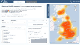
The initial cold spots mapping shows where students may or may not be able to study SHAPE subjects. This map shows changes in provision between 2011-2012 and 2022-2023. We wanted to know if there are particular regions in the country with no or limited provision for individual SHAPE subjects, and also how different tariffs (grade requirements) impact access to courses within a commutable distance.
There has been a lot of change over the last decade in higher education provision, and we're trying to chart that and tell the stories that we can find in the data.
The tool allows users to explore the data and to visualise how subjects have been changing in terms of student uptake and how this has varied across institutions and regions. Where do students find it more difficult to study SHAPE subjects in their local area?
Why was it created?
The higher education sector is changing rapidly and we wanted to build an evidence base to show the impact of some of these changes on opportunities to study SHAPE subjects. We hoped this could be used to inform decisions, to understand impacts, and as an advocacy tool.
The project developed in part out of the British Academy's long-standing concerns about higher education provision for languages. Becky Muradás-Taylor had mapped language provision changes over the past decade in England. She was particularly interested in the tariff issue: what access is there for students with different grades across the UK?
We know that disadvantaged students are much more likely to study close to home, and that's also true for Black and minority ethnic students, so we wanted to see how we could expand this methodology to SHAPE disciplines more broadly.
The data and its processing stages
Tell us about the data.
There are three processing stages: first processing student data to create the main database; then from student level data to provider level (aggregation of the data); and then from provider to geographical areas (the cold spots analysis).
We used a portal called Heidi Plus to access Higher Education Statistics Agency (HESA) data. This provides student level data on a lot of student characteristics, including age, ethnicity, gender, disability and domicile status. The data we used gave us around three million rows. We chose to look at first year first degree UK-domiciled students age 20 and under, as we were interested in understanding access to SHAPE degrees for a 'typical' entrant to higher education, as the average age of entry is still 18.
We also had to represent each university just as one point on the map. We know that many universities have multiple campuses. This therefore is a limitation of our analysis and for this reason we don't include the Open University in this phase of the work.
We also used data on subject and tariff codes. These have changed over time and tariffs can vary by devolved nation, presenting another challenge in looking at data over a twelve-year period. To overcome this, we had to build two databases to reflect the changes and then unify them to create a unique database.
Methods and tools used
What methods did you use to collect and analyse the data? What tools did you use to create the visualisation?
At the beginning, we used R to visualise the data. We created a grid of the UK, and then we measured the distance between universities to every grid, colouring the grids accordingly.
We wanted to create an interactive map so that users would be able to filter by year, by subject, by tariff and by degree type in terms of joint honours or full honours. We were using static images produced in R and filtering these. This wasn't a very effective technique in terms of computation power.
So, we decided to explore Power BI. It made it much easier and more efficient to create heat maps as you could select the bubbles representing a higher education provider. However, Power BI as software can be very manual, especially with regard to the design, so it's been an iterative process.
When choosing the commutable distance, we had different approaches to draw upon, including research from the Office for Students (OfS) and the Sutton Trust. In the end, we decided to go with 60 km as commutable distance, even though some other models had used 90 km, as this seemed an overly long distance. However, some feedback from users so far has indicated that 60 km is an unrealistic commute because of limited transport infrastructure in large parts of the country.
Reasons for creating an interactive visualisation
Why did you choose to present the data in this way over other approaches?
We wanted to create an interactive visualisation that we hope will be intuitive for users. And considering the research question is about regional access, the obvious approach for us involved using maps.
The map allows subject advocates and policy makers, whether at a national or local level, to understand SHAPE course numbers, impact of closures and changes over time.
Often decisions are made by an individual higher education provider based on their circumstances. Their priorities are not the wider impact of subject provision in the region. This map and tool allow that impact to be better understood.
Over time we could add more data, like international students or more data on accessibility for disadvantaged student groups.
The findings and anticipated impact
Could you tell us about some of the findings? What impact are you hoping the visualisation will have in research, policy and other contexts?
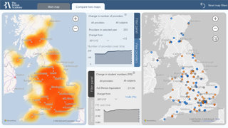
The cold spots mapping reinforced our sense that languages have been acutely hit by closures and contractions, with withdrawals of provision in quite extreme ways in some circumstances.
However, with this tool we can now see important differences across SHAPE disciplines. Provision and uptake of certain subjects, such as Business Studies, Psychology and Law, have been growing rapidly, while English and History have seen numbers decrease.
The results in Scotland are particularly interesting in terms of tariff barriers. A lot of the maps 'go dark' when you exclude the high tariff institutions.
This project offers interesting insight for higher education policy. The maps clearly show the regional impact of major policy shifts in higher education since 2011-2012. This tool will allow us to monitor the impact of closures and our next step is to create a map of changes to staffing numbers.
It's a really useful tool for subject associations and university departments to understand what's happening in their disciplines and for advocacy.
The SHAPE Observatory, of which this is a part, is a central hub that people can come to and get a data-led sense of what's going on in the sector.
Advice for using this visualisation technique
What steps can others take to try this visualisation technique? What's your one top tip for geographers looking to visualise data in this way?
The first step is to take the time to think about the research question and what it is you really want to understand. And then finding out if the technique you have in mind is really the best for that particular question.
Scoping a different range of techniques and tools is the next step. For example, members of the team knew R, so we started working with R. Three months later, we realised that we could do the same thing much more quickly on Power BI.
Explore the interactive maps
To explore the interactive maps in more detail, take a look at the British Academy web page.